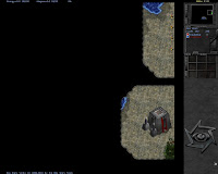
I filled a recent craving for playing a sci-fi real time strategy game by re-discovering Bos Wars and playing every single player map.
image: Bos' level of art, many screenshots indicate a much lower quality.
The game runs on low-spec computers and can be quite fast-paced. I quite enjoyed playing it in a tower-defense/tower rush style. The last release of Bos Wars has been over two years ago, but development is not frozen, the last commit was on 2012-08-09.
The three biggest issues I personally had are:
- Some maps are aesthetically displeasing.
- For a beginner, it's hard to decide what map to play.
- Many units and buildings don't have voices/sounds.
- The interface is confusing in regards to resource quantity.
Visual style of old maps

image: most likely the first map you play in Bos (because it's selected by default)
To address issues 1 and 2, I hope that this blog post will help. The screenshots at the bottom show the game start screen at 1280x1024 for every of the "Start Game" single player maps. If you see a level that you'd like to play, right-click and "open" the link or image, to see the level name in the file name of the screenshot.
An in-game solution to issue 1. would be to create a map folder called "old" and move all levels in there, when the rendered ground texture clashes with the units, buildings and resources.
This suggestion might be seen as disrespectful insult to the original map makers, but having the current map selection structure is a barrier for new players, who need some guidance to get started without having to open random levels first. They are likely to assume that the first level they play is representative of the visual style of the entire game, which can be quite wrong, as you can see by the different-looking screenshots at the bottom.
Map selection screen
image: Bos Wars map selection screen
To solve issue 2 in-game, a preview of the mini-map, as it is seen with "non-revealed map" would help. This might be a non-trivial UI/in-game-rendering task if it has to work fully automatic.
Missing/repetitive sounds
In regards to issue 3, I started by contributing a patch with some voices and sounds. If you would like to help as a voice actor or by turning voice lines into soldier/pilot/driver voice/effect mixes, please feel free to comment in this blog post, if you would like to coordinate this with me and other potential contributors. Female voices are especially welcome (source).
Feedback on my patch is welcome too. Watch/listen to the video below, to see what kind of voices are missing and what kind of voices are being used multiple times in Bos Wars.
video: Unit sounds in Bos Wars
Resource UI
I'm not sure I have figured it out completely but here goes nothing.
image: how I interpret Bos' resource info
Without having thought this through in detail, this is what seems to be missing:
- Resource icons.
- Absolute value of resources in stock, rather than divided by ten(?).
- Color coding of income/spending.
- Display of the sum of income and spending - in a prominent position, individual display of income and spending in a non-prominent position.
- Indication of resource effect by buildings when selecting buildings and when hovering them in the build menu.
Starting screens of all Bos Wars maps
If you see a level that you'd like to play, right-click and "open" the link or image, to see the level name in the file name of the screenshot.
gallery: All Bos Wars maps


No comments:
Post a Comment